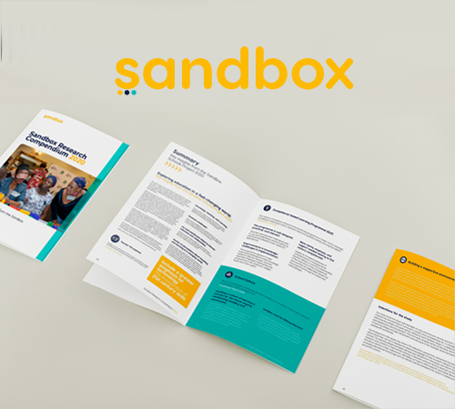
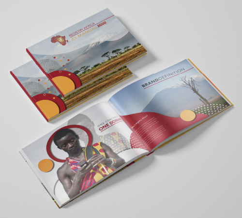
We build a report which esnured that it attracts and hold users' attention, th quality of the report had to be designed in a way that Makes it easy for people to skim and find topics of personal interest. This book is a very detailed resource on research related to design and its impact?.
The Process we Took
- Formatted the title so that it stands out and is easy to read.
- Added a tag line that users know what the report is about, why they should care, and how they can use the information.
- Used design features such as colour accents, photos and other images to draw attention to and emphasize the title and tag line.
- Sandbox Innovation Learning Programme Report
- Broke up the text into short paragraphs and bulleted points so that it’s easy to skim (no "wall of words" to discourage your readers).
- Kept the layout simple and uncluttered, with plenty of margin and white space (blank areas that give the eyes a chance to rest).
- Left justify the text to make it easier to read. Readers sometimes overlook titles that are centered.

