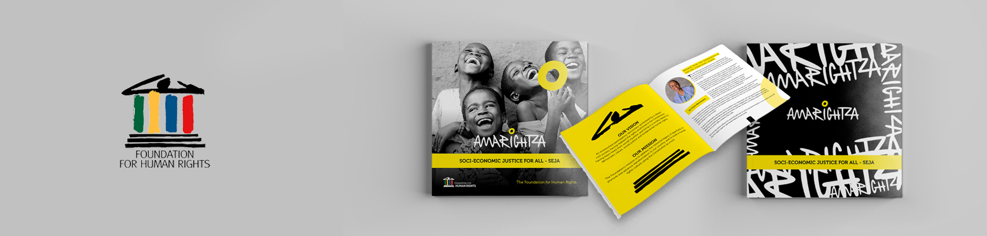
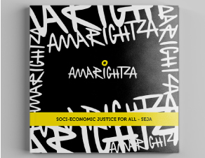
The FHR team opted for Museo, a typeface that was used as part of the initial Amarightzacampaign branding.
It’s a simple but effective structure – the editorial frames the work, which is printed on an uncoated paper to reflect the material that the Amarightza posters were originally printed on. The surrounding narrative is reproduced on a coated stock so the photos of the stakeholders pop out.Ultimately, we had to become really familiar with the book’s content. Get close to the narrative, and remember that design and typography is a fundamental part of delivering any story.
“In this case, we were very conscious that we didn’t want to ‘out art the art’. The design of this book needed to be recessive to the content, which was the real hero. So it had to be quiet and unopinionated, while acting to frame another designer’s work and give it context. Ultimately it was a question of respect.